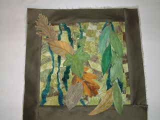
Leaves #3 version 2. With both of these versions I was visualising vines on the wall with dead leaves caught in them

An online diary about my creative life which includes dyeing, quilting and teaching plus thoughts and experiences as they occur about the more mundane aspects of my life and also pictures of my home town and places I visit. To see more of my creative works go to my site Farne Designs
|
|
|
|
Nice colors!
ReplyDeleteWow, can't decide which leaves scene I like best-- I love how they drape over the bottom-- makes me want to play with them and flip them up to see what's underneath!
ReplyDeleteYour sea scene looks like it could be a book illustration.
And so glad you're getting your internet problems fixed. Been there myself, felt cut off from everything. Seemed like I needed access even more, just because I couldn't have it!
I think version 1 of the leaves is my favorite. The way the two leaves fall out onto the frame appeals to me. Can't wait to see this quilted.
ReplyDeleteI love the way the triangles are scudding across the bottom in the sea scene and the color of the sails, mmmmmm.
I prefer the extra dimension added by the leaves falling below the frame;it's a tactic I use to add more interest.
ReplyDeleteBut hey I'm an amateur!
I love this quilt. I like the watercolor quality of the leaves and the linear feel of the stitching, the composition, everything. Jen
ReplyDelete